Linbury Theatre
May 2022
Mavra + Pierrot Lunaire opera programme, 165x230mm
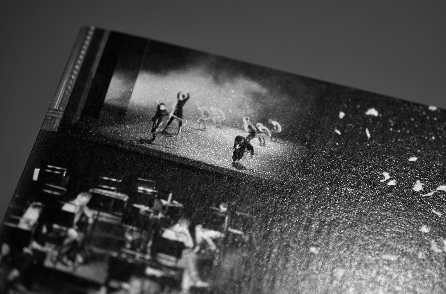
The double bill of Stravinsky’s Mavra and Schoenberg’s Pierrot Lunaire is an unusual pairing. What links them, as director’s Anthony Almeida staging makes clear, are ideas about gender and identity. In Mavra an oversized ceiling-light dominates a claustrophobic domestic space, illuminating it with sun-like clarity. In Pierrot Lunaire, that same domestic space is transformed by moonlight into an otherworldly realm. Graphic concept, art direction and editorial design of the programme, with photography from Alan Knox, Camilla Greenwell and Juno Calypso. The programme was divided in two, one for each opera, featuring two covers. The colour palette followed the leads from the stage design — silver/gray/black for Pierrot Lunaire and pink for Mavra.
Nathan Larson
Nov 2025
Field Notes on Avoidance book, 200x254mm
Field Notes on Avoidance was inspired by living on the road and traveling to every state, province, and territory you can drive to in North
America. Graphic concept, art direction and editorial design. Featuring three cover variants, it is a striking collection of poems and photographs: CMYK printed on Munken, section sewn, exposed bound with coloured thread, Fedrigoni Sirio endpapers, black foil applied on title.

Imagens do Real Imaginado
May 2025
project for website and social media campaign
The aim was to design a website for a festival of photography, cinema and multimedia — Imagens do Real Imaginado.
The annual festival is organised by the ESMAD School of Polytechnic of Porto. Every year, and for the last 21 years, the festival revolves around a new theme. Being an event on imagery research and production, the design proposes that images occupy at least 50% of the screen in every page (desktop version). The users/image producers are also invited to contribute here: everyone can submit imagery to be featured on the website. The Windows 95 buttons work both as a nod to a reference of digital and as a reminder of the age of the digital age.

World of Fine Wine
2016—2018
quarterly magazine, 210x297mm
Design for the quarterly magazine The World of Fine Wine, from 2016 to 2018. The World of Fine Wine is a publication that works with some of the world’s most respected wine writers, offering authoritative editorial content. Inclusion of fine art images as well as commissioned photography, transforming the aesthetics of this publication.

Linbury Theatre
2022—23
series of opera and ballet programmes, 135x290mm
Development of a graphic system for the Linbury Theatre programmes, season 22—23. The flexibility of the design/layout permitted a coherent adaptation to the ever changing type and amount of content. The format (135x290mm) also allowed a better use of the printed page, creating less waste, with sustainability as a priority of the project.

Last Days
Oct 2022
opera programme, 165x230mm
Last Days is an English-language opera in one act, with title and concept taken from the film by Gus van Sant — a fictionalised account of the last days of Kurt Cobain. The opera premiered at the Linbury Theatre in 2022. Graphic concept, art direction and editorial design of the programme, with commissioned photography inspired by the late 80's and 90's grunge music albums. The limited colour palette — brown and black — followed both the stage design and the costumes by Balenciaga.

Royal Opera House
Nov 2020
Christmas card collage
Graphic concept for a Christmas card for the Royal Opera House. The aim was to show the work developed during the COVID-19 pandemic. The collage was designed from three images — each one showcasing the work of the companies of ballet and opera and the orchestra. It was digitally printed over pearlescent white stock.

Blueprint Review
2016
annual magazine, 210x280mm
Founded in 1983, Blueprint Magazine is a monthly architecture and design print which offers influential criticism, news, editorial content and analysis. The issue Project Focus is a review of the best architecture projects completed in 2016.

Royal Opera House
Apr 2022
Season Guide 22—23, 155x225mm
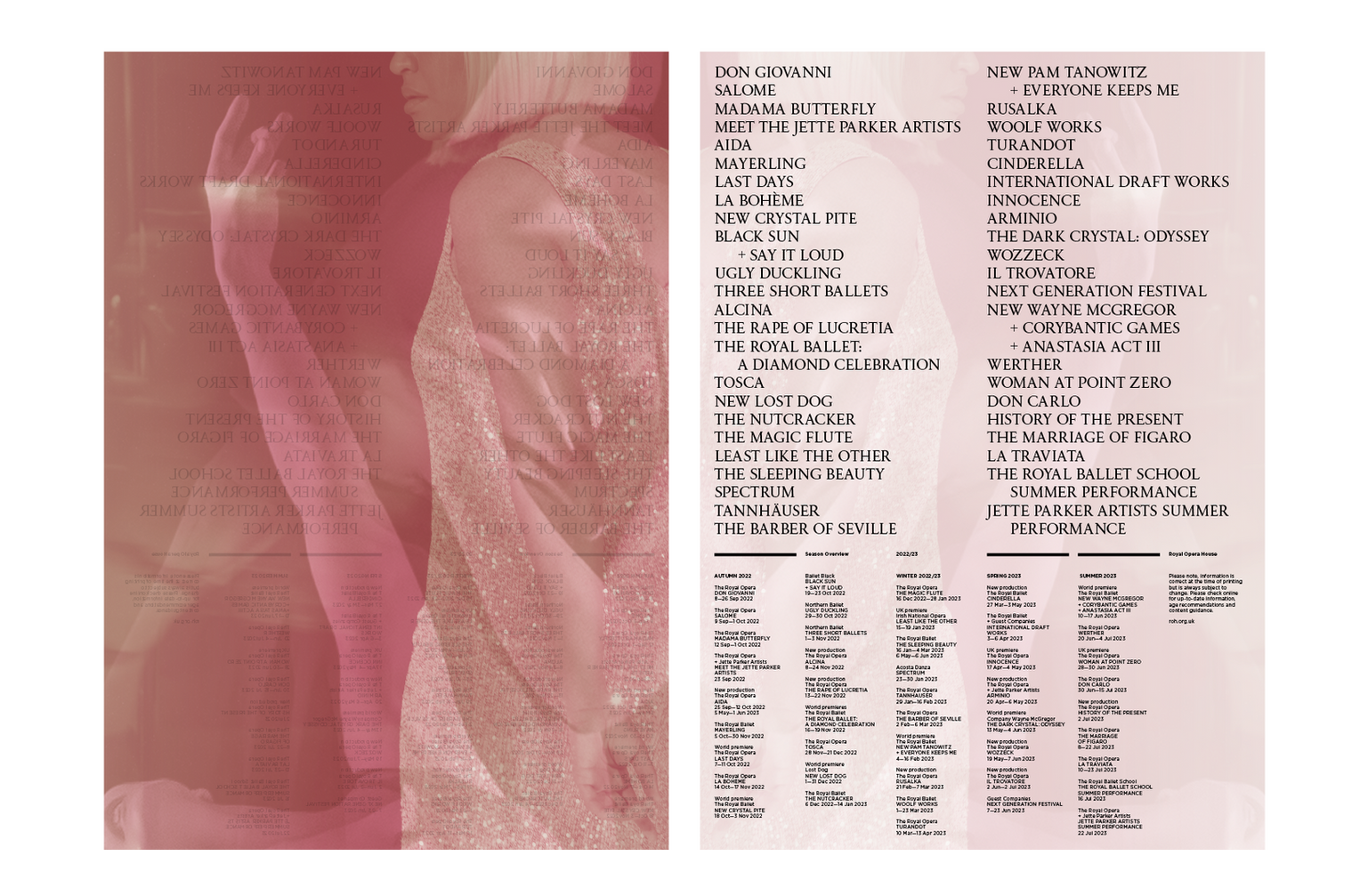
Graphic concept, art direction and editorial design for the Season Guide 2022—23. The plain white cover with black text is partially covered by a folded poster/dust jacket. The poster has been printed in a thin and semi transparent stock, showcasing a collage on one side and the calendar for the whole season on the other. The collage concept is based on representations of performance and diversity.
Wedding <3
Jun 2022
wedding card, 140x205mm
The invitation shows a detail of a star filled portrait from the European Space Agency. It was digitally printed (Indigo) with black and white inks
over red Colorplan stock.

Royal Opera House
Apr 2023
Season Guide 23—24, 115x220mm
Graphic concept, art direction and editorial design for the Season Guide 2023—24. The layout was adapted from previous editions, maintaining coherency. The format (115x220mm) permitted a smaller and lighter guide. With a print run of approximately 40.000 units, this edition was more sustainable in terms of both production and posting.

Linbury Theatre
Nov 2021
Wolf Witch Giant Fairy opera programme, 165x230mm
Graphic concept, art direction and editorial design of the programme for the opera Wolf Witch Giant Fairy, a family-friendly opera, created by
The Royal Opera and Little Bulb Theatre. Being aimed at young children and having its set design featuring a wooden platform, tall pine trees, and
a giant moon, this programme followed a limited colour palette, with a duotone design — green and warm black.


